-

How Much it ll cost to build an app like
- Cost to develop an Uber Tow Truck App
- Cost to develop a Pest Control App
- Cost To Develop a Handyman App Like Uber
- Cost To Develop a Doctor Appointment Booking App
- Cost To Develop An App Like MoodBites
- Cost To Develop An App Like SkipTheDishes
- Cost To Develop An App Like Q Chat
- Cost To Develop An App Like TickTick
- Cost To Develop An App Like ContractBook
- Cost To Develop An App Like Utter
-

How Much it ll cost to build an app like
- Cost to develop a Video Editing Mobile App like Magisto
- Cost to develop a Live Video Streaming App like Twitch
- Cost to develop an app like Home Workout- No equipment
- Cost to develop a Sports News app like theScore
- Cost to develop an Application like Reddit
- Cost to develop a Sports News app like theScore
- Cost to develop an E-learning platform like Udemy
- Cost to develop an On Demand Doctor App like Heal App
*

UI/UX Tip 6: CTAs should be eye-catching, compelling, and clear to increase conversions
Visitors to a business’ website often have a specific goal.
CTA (or Call-to-Action) prompts site visitors upon arrival to respond to this objective.
Users could be moving on to the next level of engagement or converting towards an end goal. Their actions could include downloading an ebook, buying a product or filling out a form. They are usually in the form of prominent links or buttons and allow users and businesses to quickly accomplish their goals.
Three key design strategies can direct users to CTAs:
- Clear visual guidance
- Communicating a clear and simple value proposition
- Use action-inspiring copy
Visual Guidance Directs User’s Attention
Your CTAs should be attractive. Colour is one way to achieve this. Red is a common choice of colour because it’s associated with emotion and action. However, your CTA does not have to be big. While a red button may work in some cases, it is important to consider how your CTA fits into your brand and design aesthetic. A yellow button might be more effective if your page has lots of red. Perhaps orange is more in line with your brand’s aesthetic. No matter what colour you choose to use, it must be seamlessly integrated into the user experience so that it draws the user’s interest.
Dropbox is an excellent example. The page’s design is very simple. The page has a lot of white space which allows for visual guidance. The eye is attracted to the “Sign Up for Free” CTA buttons and the button “Try Dropbox Business”. This is partly due to the buttons being prominently coloured on the page and being the same colour as Dropbox’s logo. CTAs for Dropbox are effective because they use colour and white space.
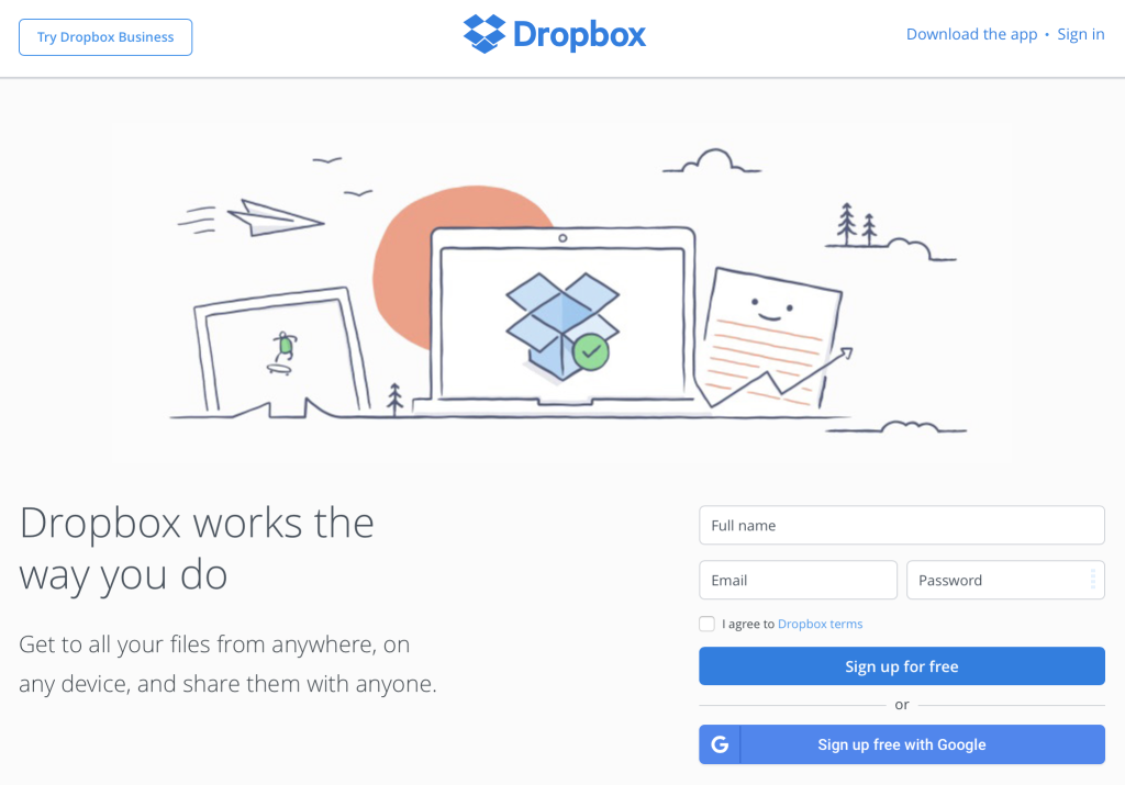
Dropbox’s design decisions are more likely to get users to respond in the desired way. Dropbox’s success is evident in its 400 million worldwide subscribers.
We believe usability tests are a great way to determine if your design decisions work. Are you interested in testing your CTA to determine if it is visually appealing? Use a Blur Test to test your CTA. The Zappos Blur Test demonstrated that people were quickly attracted to the search function, the checkout icon and a promotional advertisement. Bright contrast colours were a winning strategy for Zappos when it came time to draw attention to key functional areas such as the CTAs.
Clicking on a CTA should be simple, clear, and meaningful.
Although a CTA may look appealing visually, why should users click on it? It is important that the CTA’s value be clearly communicated. It is possible to do this by using a strong visual hierarchy and simple, understandable messaging.
Treehouse is an example. Treehouse’s CTAs might be a mystery to users. The designers explain why Treehouse can transform your life by displaying the CTA is a clear, large font, and meaningful tone.
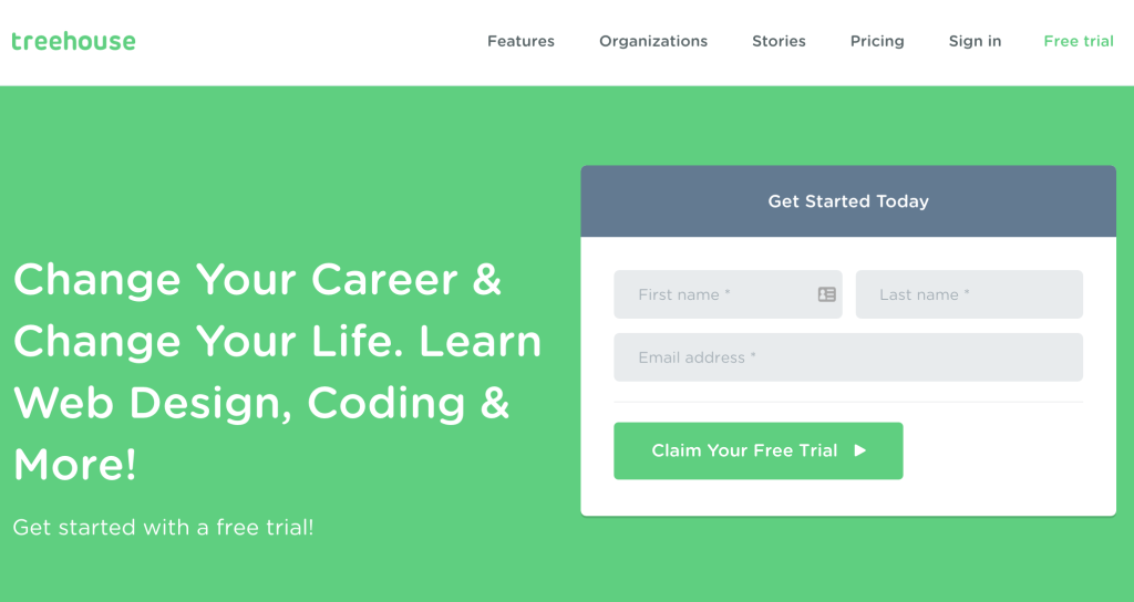
Visual hierarchy is also important. It is not enough to just scatter important information randomly. Treehouse’s designers have mastered the art of breaking down information into clear chunks that are easy to read. The value proposition is separated by a dark grey box. Colour-contrast text fields are placed in the same area. They are distinct and should be given attention. Treehouse’s designers finish it with a green CTA button, which allows users to claim a free trial.
Users don’t have to decide why they should sign-up. Users aren’t required to decide how to sign up. There is no hidden agenda. The value proposition and information hierarchy make this clear. Treehouse makes it easy to see this crucial information upfront.
Well-Written Copy Inspires Action
Visual design is crucial in attracting attention to CTAs. But words are equally important. Copy that encourages people to take action is essential for your CTA.
Pinterest is a perfect example. Pinterest invites you to sign up. What is Pinterest? What are they good at? Why should you sign-up? Pinterest’s design is simple, clear, and offers visual guidance. They also make it clear why users should act with words that encourage further exploration.
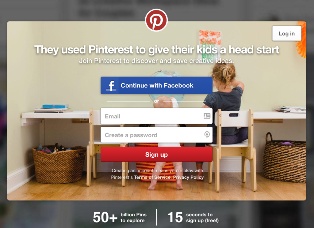
The designers combine a headline with a subheadline to tell you that Pinterest was created by parents to “give their children a head start”. You can also join Pinterest to “discover, save and share creative ideas”. Two sentences are all it takes to explain how Pinterest can work and the purpose of the application.
Pinterest’s designers also provide more information through well-written copy. There are over 50 billion pins, in fact, and it takes only 15 seconds to signup. It’s also free!
CTAs should be concise, short, and direct. A well-written copy can achieve this feat while inspiring users to take action. Pinterest’s CTA copy shows a prime example.
Effective CTAs are a great way to convert leads and produce results
CTAs are at the top end of your conversion funnel, where they turn site visitors into leads. Although it is not difficult to create effective CTAs, there are some guidelines. CTAs should be eye-catching, compelling, and clear if you want to increase conversions. This post is a great place to start!

Author
Our Partners


WhatsApp us


