-

How Much it ll cost to build an app like
- Cost to develop an Uber Tow Truck App
- Cost to develop a Pest Control App
- Cost To Develop a Handyman App Like Uber
- Cost To Develop a Doctor Appointment Booking App
- Cost To Develop An App Like MoodBites
- Cost To Develop An App Like SkipTheDishes
- Cost To Develop An App Like Q Chat
- Cost To Develop An App Like TickTick
- Cost To Develop An App Like ContractBook
- Cost To Develop An App Like Utter
-

How Much it ll cost to build an app like
- Cost to develop a Video Editing Mobile App like Magisto
- Cost to develop a Live Video Streaming App like Twitch
- Cost to develop an app like Home Workout- No equipment
- Cost to develop a Sports News app like theScore
- Cost to develop an Application like Reddit
- Cost to develop a Sports News app like theScore
- Cost to develop an E-learning platform like Udemy
- Cost to develop an On Demand Doctor App like Heal App
*

UI/UX Tip 17: Color Has Meaning
For users to feel inspired, color is an essential design element.
It is important to know the psychology and meaning of color so that you can create the appearance, feel and order of your experience.
The field of color theory is vast and many books have been written on it. It’s a complex topic with many implications for design. This principle reminds us that color decisions shouldn’t be made haphazardly. As you use the different meanings of colors to enhance your design, we recommend that you be purposeful.

Color Captures Attention
Why should they visit your site? What is in it for them? What is engagement? What do you want them doing?
These are essential questions that you must answer. No matter what your answer is, color can be a key to achieving your goal.
The Smashing Book #1 explains that color can grab a user’s attention, and get them to engage with a website. [ . . . ] They should be drawn to your design and content by the colors you choose. To draw their attention to the most important parts of your website, you can use color.
Amazon’s use orange to highlight products or important CTAs is an example of how color grabs attention. Amazon’s orange variations focus attention on the most important areas of the layout.
Orange is associated with energy, fun, haste and impulse. It’s loud. The screen above shows the visual clues that draw attention to the title, value proposition and ability to add product to cart in a single click.
They don’t overwhelm us by orange. They strategically use it in places where energy, impulse, activity and fun are most important. Amazon wants you click, scroll, explore. Because of their wealth of content, Amazon uses orange to make sure you see the signals they don’t want you to miss.
Color conveys brand and emotion
The Smashing Book #2 explains that color has a wide range of effects on people. The color of our emotions, psychologically and physically affects us all.
Our collaboration with Thrift Book is a prime example of the psychological and emotional effects of color. Their goal was to create a contemporary look and feel warm by redesigning their website and brand. This philosophy is embodied in Thrift Books’ cutting-edge technology operations and care of books. This message is also communicated clearly through the brand colors, which combine a modern, cool aesthetic with the warmth of a beloved book.
The perception of “thrift” was another consideration. Many books Thrift Books sells in ‘Like New” condition. All books pass a quality inspection. The books are presented in a modern, cool aesthetic to emphasize the product’s high quality. They are “nearly old” rather than “dusty, old.” This modern aspect of Thrift Books was reinforced by the use of teal and white.

Online bookstores offer a different experience. We wanted to recreate the feeling of comfort and warmth that comes with reading a favorite book in your favourite chair. These elements are reinforced by the use of brown, yellow, and ruby colors. They also reinforce thriftiness in a positive way when paired with modern primary colors. The brand’s color psychology was a result of deep thought. It was designed to connect with customers and reinforce their brand ethos.
Color Creates Hierarchy
Users will be asking lots of questions when they visit your site. If these are not answered quickly, it may lead to them abandoning the site. What should they do first? Where should they start? What can they do to get from Point A and Point B, and achieve their goal?
FitBit’s website designers use color to create hierarchy and highlight calls to action. As their primary CTA, the bridge’s deep brown color is dominated by Action Orange. Teal is used to indicate a new section, which draws attention further down the page.
The authors of Creating Exciting, Unusual Visual Hierarchies write that color has many roles in creating hierarchy and adding dimension to the information order. While bright and vivid colors are more appealing, we can also use softer colors to reduce detail.
This principle is evident in FitBit’s use color to create visual hierarchy.
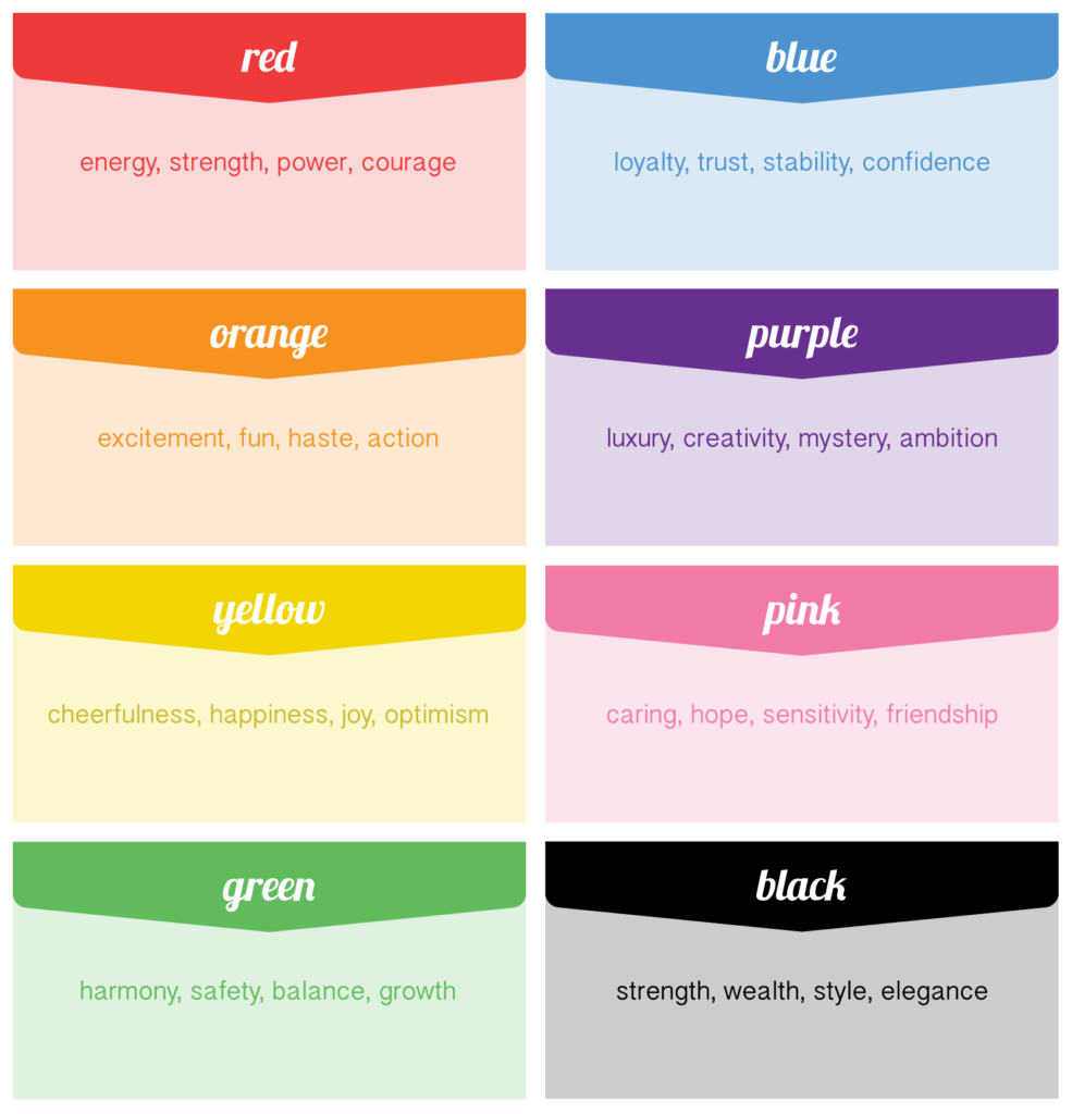
What Does Color Mean?
This is just one perspective on color. We hope this perspective on color serves to remind you how important color can be in your design. It is easy to overlook the significance of colors and assume certain colors will flow with a design. To guide users and improve the digital experiences and brands you create, it is important to understand what colors mean. It is important to know what colors mean.

Author
Our Partners


WhatsApp us


